How to Choose a Basic Color Palette for Acrylic Painting?
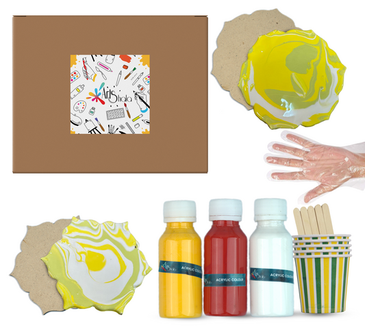
Selecting the right colour palette is a cornerstone of any painting. The possibilities are vast with acrylics, but starting with a solid foundation is crucial. This blog will help you build a basic colour palette, understand colour theory, and make informed choices for your acrylic painting journey. To learn more about such techniques, enrol in an acrylic painting workshop.
Understanding the Basics
Before diving into specific colours, it's essential to grasp fundamental colour theory.
-
Primary Colours: Yellow, red, & blue are the rock of colour. They cannot be created by mixing other colours.
-
Secondary Colours: Mixing two primary colours makes Orange, green, and purple.
-
Tertiary Colours: These are created by mixing primary and secondary colours.
-
Colour Temperature: Colours can be warm (red, orange, yellow) or cool (blue, green, purple).
-
Hue: This is the pure colour, without any white or black added.
-
Tint: A hue mixed with white.
-
Shade: A hue mixed with black.
-
Tone: A hue mixed with grey.
Building a Basic Palette
While you can create countless colours by mixing, a core palette will streamline your process. Here’s a suggested starting point:
Essential Colours
-
Cadmium Red (or Permanent Red): A warm, vibrant red.
-
Cadmium Yellow (or Lemon Yellow): A bright, sunny yellow.
-
Ultramarine Blue: A deep, cool blue.
-
Titanium White: Opaque white for highlights and mixing tints.
-
Burnt Umber: A warm brown for shadows and mixing earth tones.
-
Black: For creating deep shadows and mixing dark colours.
This palette offers a versatile range for various subjects.
Expanding Your Palate
As you gain experience, consider adding these colours:
-
Phthalo Blue: A highly pigmented, intense blue.
-
Viridian Green: A bluish-green for natural scenes.
-
Dioxazine Purple: A deep, rich purple.
Pro Tips for Color Selection
Consider Color Bias
Each colour has a bias, meaning it leans towards a particular hue. For example, Cadmium Red has an orange bias, while Alizarin Crimson leans towards blue. Understanding these biases helps you predict how colours will mix and interact. A balanced palette should include colours with both warm and cool biases to create depth and variety in your artwork.
Quality Over Quantity
Investing in artist-grade paints can significantly impact your results. While student-grade paints are more affordable, they often lack the vibrancy and coverage of higher-quality options. Consider starting with a few high-quality tubes rather than many lower-quality ones.
Experiment with Limited Palettes
Limiting your palette can encourage creativity and help you understand colour mixing better. Start with just three colours and white, then gradually add more as you become comfortable. This method teaches you to mix colours effectively and develop a unique style.
Use Complementary Colours
Incorporating complementary colours (colours opposite each other on the colour wheel) can enhance your artwork. For example, pairing blue with orange or red with green creates dynamic contrasts that can make your paintings pop.
Test Before Committing
Always test your colours on scrap paper or canvas before applying them to your main work. This practice lets you see how colours interact and ensure you achieve the desired effect.
Additional Tips
-
Invest in Quality Paints: Good quality paints offer better pigmentation and consistency.
-
Clean Your Palette Regularly: A clean palette prevents colour contamination.
-
Use a Colour Wheel: A colour wheel is valuable for understanding colour relationships.
-
Practice Colour Mixing: Regular practice will improve your ability to mix accurate colours.
-
Don't Be Afraid to Experiment: Colour mixing is a journey of discovery.
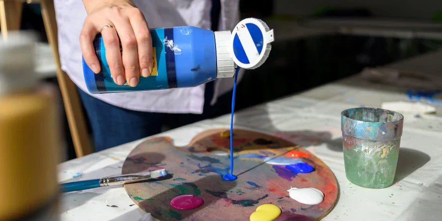
Mixing Colours
Once you’ve selected your basic palette, understanding how to mix colours is essential. Here are some tips:
-
Start with a Base Colour: Choose your primary colour as a base and gradually add other colours to achieve the desired hue.
-
Use a Palette Knife: A palette knife helps achieve a more thorough mix than a brush, ensuring an even distribution of colour.
-
Add White or Black for Tinting and Shading: White lightens a colour (tint), while black darkens it (shade). Be cautious with black, as it can overpower other colours; instead, consider using darker hues like Burnt Umber for shading.
Colour Mood and Emotion
Colours have the power to stimulate precise moods and emotions in the viewer. Understanding how colours affect the overall mood of your painting can help you make more informed decisions when choosing your palette. Here are some general associations:
-
Warm colours (red, orange, yellow) feel energetic, passionate, and vibrant.
-
Cool colours (blue, green, purple) often convey a sense of calmness, serenity, and tranquillity.
-
Neutral colours (white, black, grey, brown) can create a sense of sophistication and balance.
Consider the mood you want to bring in your painting and select colours accordingly. For example, if you want to create a cosy and inviting atmosphere, choose a warm palette with earthy tones.
Adapting to Different Mediums
While the principles of colour theory remain the same, how colours behave can vary depending on your medium. Acrylics, for instance, are known for their vibrant and opaque nature, while watercolours are more transparent and delicate. When choosing a colour palette, consider the unique properties of your chosen medium and how it will affect the final result.
Practical Application
To illustrate how to use your colour palette effectively, let’s consider a simple painting project:
-
Sketch Your Composition: Lightly sketch your landscape on a canvas using a pencil.
-
Select Your Colours: Choose your primary colours based on the elements in your landscape (e.g., greens for trees and blues for the sky).
-
Mix Your Base Colours: Mix a base colour for the sky (e.g., a light blue) and apply it to the top of your canvas.
-
Layering: Work from the background to the foreground. Add layers of colour for mountains, trees, and ground, mixing shades and tints as needed.
-
Final Touches: Use your palette knife to add highlights and texture, and don’t forget to step back frequently to assess your work.
Conclusion
Choosing a basic colour palette for acrylic painting is vital to creating impactful artwork. You can enhance your artistic expression by understanding colour theory, exploring harmony, and considering the emotional resonance of colours. Remember to work with different combinations and techniques, allowing your creativity to flourish. As you gain experience, trust your instincts and enjoy the journey of discovery. With practice and an open mind, you'll develop a unique style that reflects your vision and passion. Embrace the world of colour, and let it inspire your acrylic painting adventures! Contact Us to learn more about this art form or visit Arts Shala’s website.